
2022 — Austin, TX
I Weird You So Much
I Weird You So Much
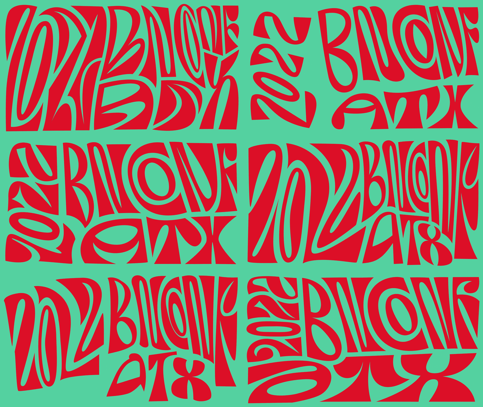
Inspired by Austin’s “Keep Austin Weird” spirit, the 2022 identity centered on highly expressive, morphing typography. I developed the lettering and motion language, transforming the Ozik typeface into fluid, constantly shifting compositions used across the website, social media, speaker animations and opening titles. The red-and-mint palette and script typography drew from the city’s iconic “I Love You So Much” mural.
https://www.behance.net/gallery/156182779/2022-Brand-New-Conference-Identity
https://www.behance.net/gallery/156182779/2022-Brand-New-Conference-Identity
2023 — Chicago, IL
The Kraft of Pizza-making
The Kraft of Pizza-making
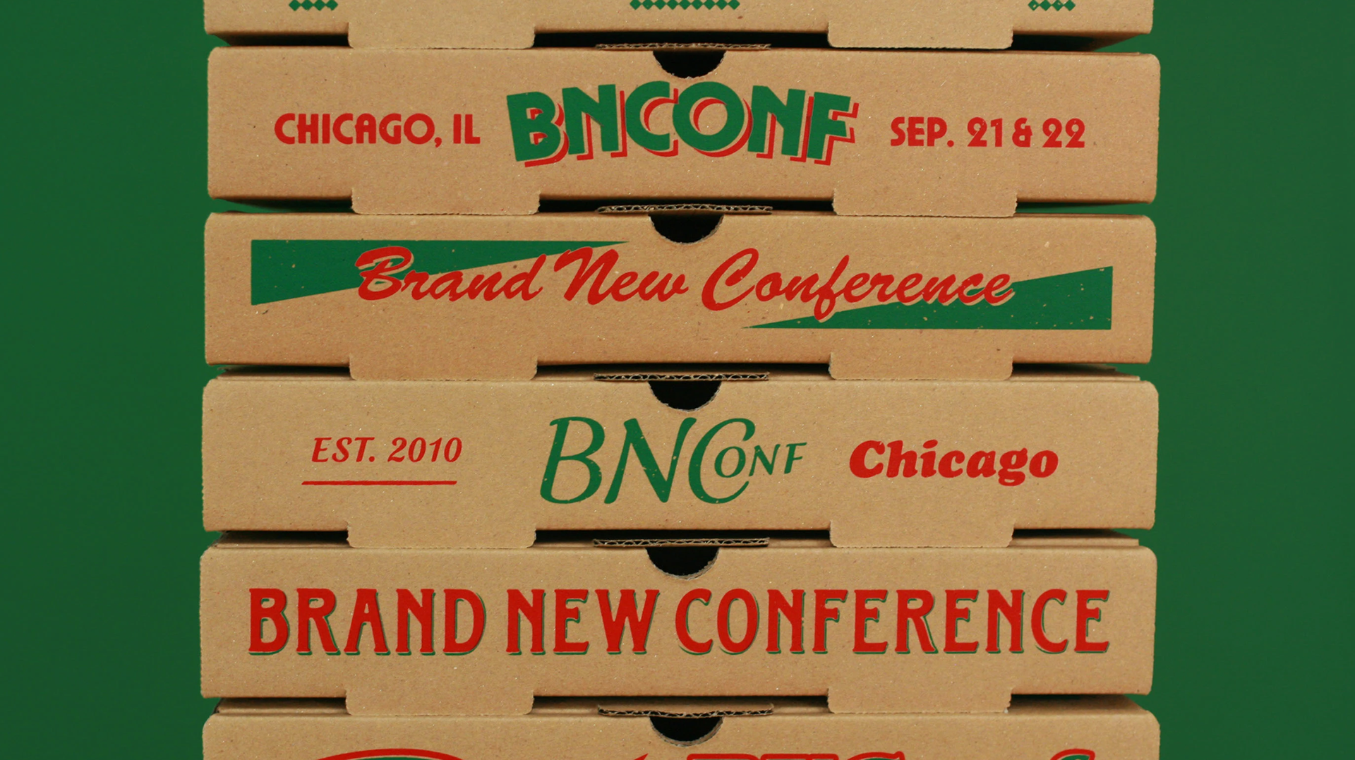
The 2023 identity took inspiration from Chicago’s neighborhood pizza joints, particularly tavern-style pizza, kraft boxes and imperfect low-fi printing. Building on a collection of fictional pizza brands created by UnderConsideration, I translated the graphic system into motion through jittery textures, exaggerated overprinting and fast-paced typographic animation. I also created the opening titles and three motion systems used across the speaker introductions.
https://underconsideration.com/brandnewconference/2023/about_the_identity.php
https://underconsideration.com/brandnewconference/2023/about_the_identity.php
2024 — Salt Lake City, UT
Move Mountains
Move Mountains
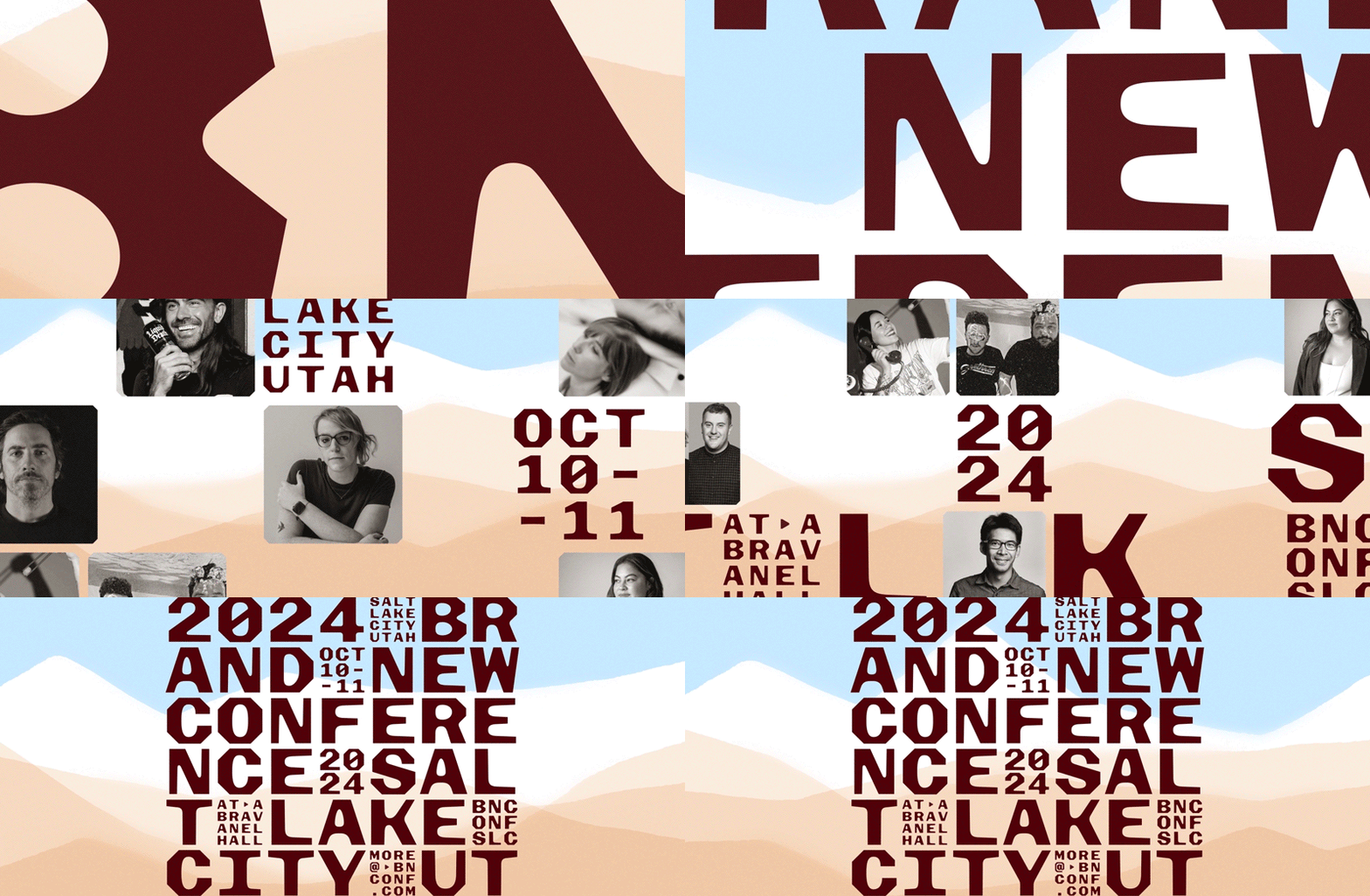
For Salt Lake City, the identity was built around the Wasatch Range and the city’s rigid street grid. I developed the motion system around layered mountain forms, using sudden shifts and exaggerated tectonic movement to contrast the otherwise calm landscape. The system extended into speaker graphics, opening titles and the wider digital identity.
https://www.underconsideration.com/brandnewconference/2024/about_the_identity.php
https://www.underconsideration.com/brandnewconference/2024/about_the_identity.php
2025 — Pittsburgh, PA
Steel City
Steel City
Returning to Nashville, the 2026 identity moves away from the city’s more obvious country-music references and instead embraces its reputation as a major bachelorette-party destination. The system combines bright pink, exuberant script typography, contemporary Western type, rhinestones, fringe, mylar balloons and other celebratory details associated with Nashville nightlife. I translated the identity into motion across the conference experience, building animated graphics, speaker content and opening titles around its playful, high-energy visual language.
https://www.underconsideration.com/brandnewconference/2025/about_the_identity.php
https://www.underconsideration.com/brandnewconference/2025/about_the_identity.php
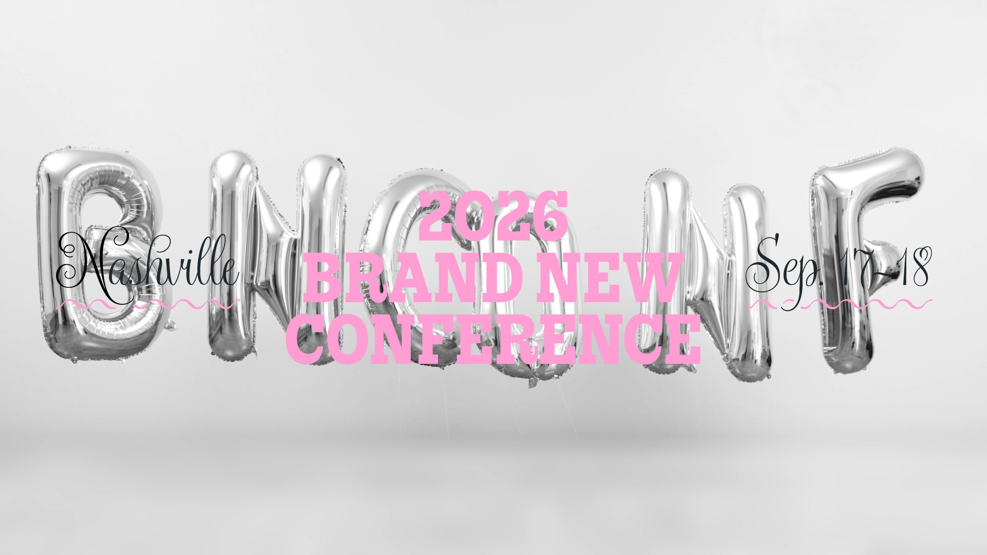
2026 — Nashville, TN
Batch, Please.
Batch, Please.
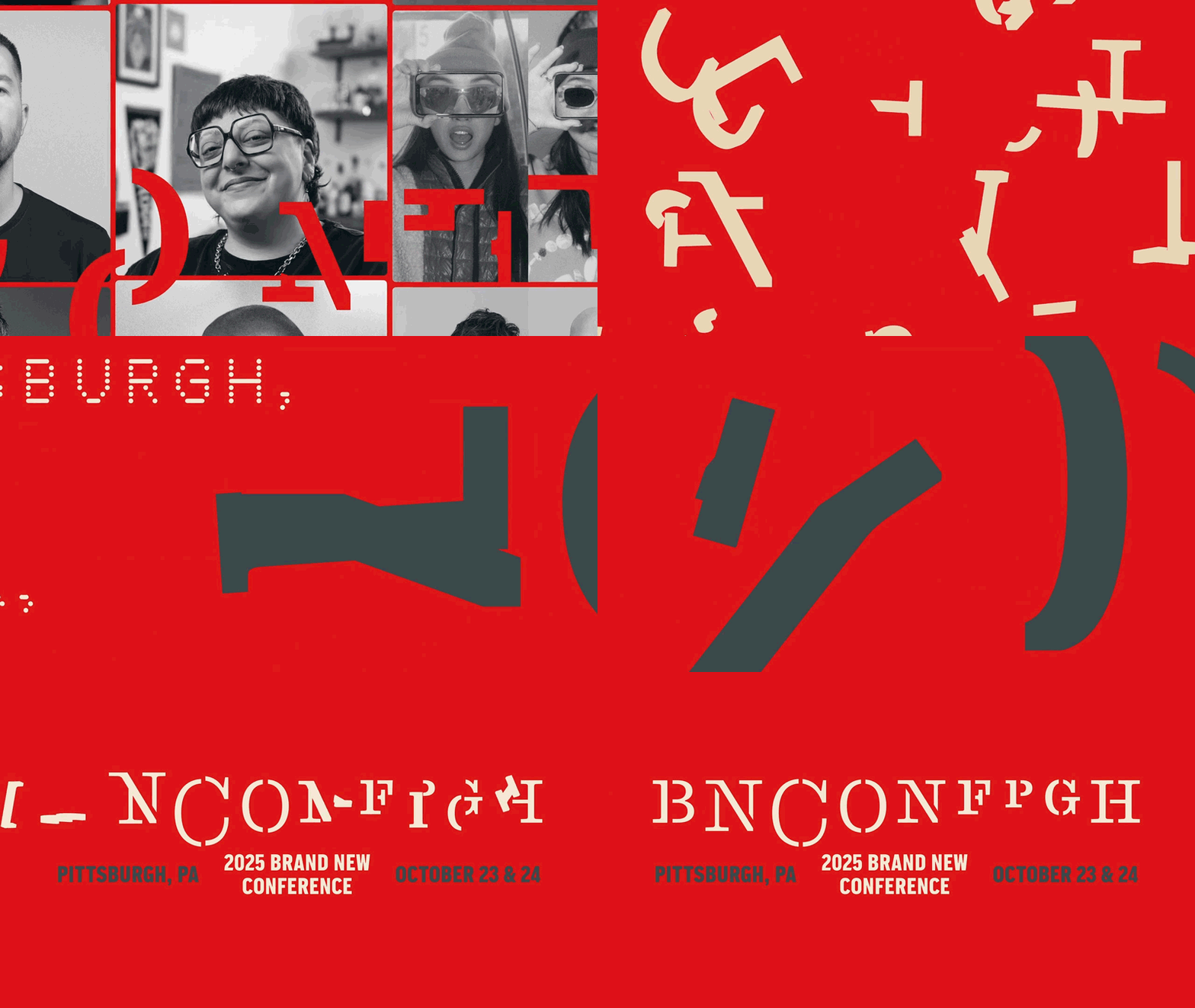
The 2025 identity drew from Pittsburgh’s history as the “Steel City” and its extensive network of bridges. UnderConsideration developed a structural typographic system using custom stencil forms based on Stringer, while I translated the identity into motion for the opening titles and speaker introductions. The resulting animation leaned into industrial rhythm, heavy mechanical movement and the structural character of steel.
https://www.underconsideration.com/brandnewconference/about_the_identity.php
https://www.underconsideration.com/brandnewconference/about_the_identity.php